


See how Business Intelligence dashboards can help you crush costs, avoid delays, and improve the patient experience
Given the volume of claims that need to be processed, and the timeframes required, it’s little wonder that health payers struggle to keep up—and even keep apprised. How many claims are open at a given time? How many are getting processed on time… and how many aren’t?
The nagging questions are enough to make anyone lose sleep:
- What’s the average cycle time from date of receipt?
- What’s the average cycle time from date of service?
- How many are being held by A/P?
- How many will be overdue is not processed by tomorrow?

And those are just the high-level concerns. Ideally, you’d like to have a lot more information at your fingertips. Wouldn’t you love to be able to easily see:
- How these numbers shake out by line of business, such as commercial, Medicaid, and Medicare?
- How many claims are being held up, simply because they require more information?
- How many illegible faxes you’re receiving… and who’s submitting them?
- How your individual examiners are performing?
Currently, there’s a good chance that the basis for this information is hiding from you amid reams of spreadsheets that would be impossible to scour, let alone quickly, to derive these kinds of insights.
But with properly-configured business intelligence (BI) analytics—the kind you can get, easily, from The Lab—this kind of decision-making power is right at your fingertips.
Health Payer Analytics 101
If you’re new to BI analytics, think of it this way: It’s like your own private website, configured like a quick-read dashboard. It’s got different filters which you can check or un-check, and you can easily drill down, or zoom out, as needed. Under the hood, it’s taking your actual information—all those tons of data—and crunching it for you in real time, and serving it up in an easy-to-read graphical display. It’s totally intuitive; you can simply click around and see what’s there. No training required.
Don’t believe it? Simply watch this three-minute demo video from The Lab:
All the power to you
The Lab configures health-payer dashboards to make them instantly usable. For example, all the high-level numbers you’ll want to see are arrayed right across the top, such as open claims, processed claims, unprocessed claims, cycle times, and so on.
And as soon as you click one thing, everything else updates. All the easy-to-read bar graphs, for example, will re-sort claims by status. Quickly see the “worst offenders” among open claims, such as those awaiting release to A/P, the ones with referrals required, or the insidious “NIGO” claims—the ones that are “not in good order” upon submission and thus must get kicked back for more information. As you can see in the video, this one bar on the graph accounted for more than 900 claims that were simply “missing information.” That’s a clear call-to-action for upstream improvement.
Better yet: You can find out who is responsible for those incomplete submissions! Filter them by provider! Just like that!
See who’s doing what
The health payer dashboard in our video also has two other “views” available—that is, different ways to visualize all the data it’s crunching.
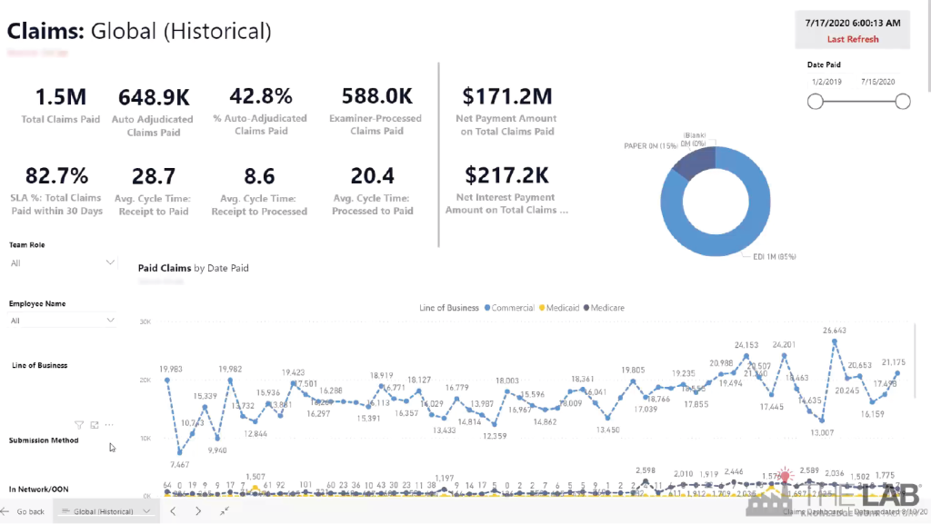
The first of these is the “historical” view. As you can certainly guess, it allows you to look back, over time, for trends in performance. It’s easy. Simply set the date-ranges you want, and watch all the data line up before your eyes. See historical performance for parameters such as:
- How many claims paid.
- Average cycle times.
- How many were paid on time.
- Total payments.
- Total interest.
- Paper vs. electronic submissions.
You can easily filter by:
- Type of examiner.
- Line of business,
- Submission method.
- Provider.
The second view is perhaps the most powerful one in the suite. It lets you see actual claims processed… sorted by individual examiner. See how they compare, in terms of claims processed, and cycle time. See how much overtime they’re consuming—and how it tees up (or doesn’t) with the top performers.
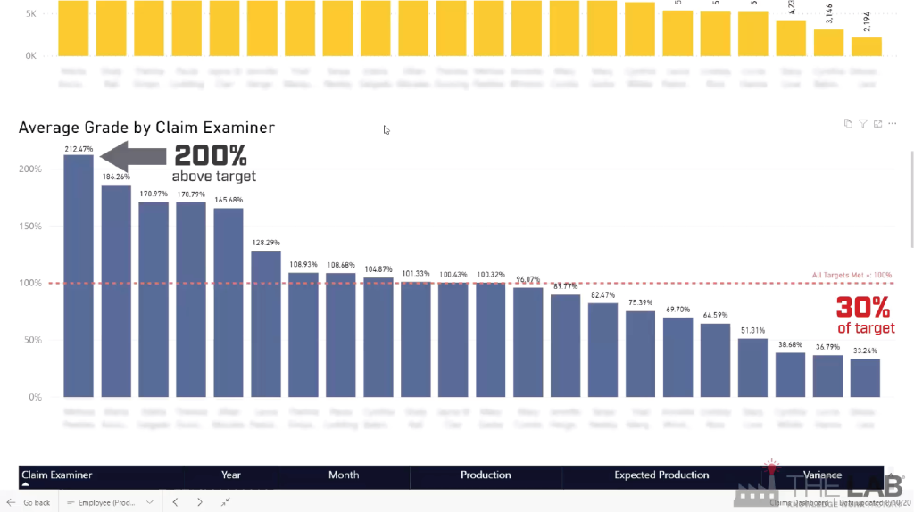
Importantly, you can see, at a glance, who’s performing above your set target… and who isn’t. It’s inarguable information.
And just to make management easier, The Lab builds in “report cards.” So you can sort your examiners by grade; it’s easy to see who deserves praise—or remedial attention.
Similarly, The Lab’s health-plan dashboards let you sort IPAs, and even individual providers, in terms of how well they’re helping the claims process along… or not.
And a bot for extra measure
You might think that things couldn’t get any easier for your health plan. But they can. Just to simplify matters, The Lab routinely creates a robot which scans the dashboard and creates daily and weekly summaries of key findings, and emails them directly to managers and leadership! It’s a great way to keep everyone up-to-date and performing at peak capacity.
It’s one thing to read about BI analytics for health plans, or even to watch a video. But it’s another thing entirely to see it in action for yourself. That’s why we invite you to book your free, no-obligation 30-minute screen-sharing demo with The Lab. You’ll see real health-plan BI dashboards in action, get all of your questions answered, and see how we’re able to do all of this remotely from our offices in Houston. Simply call (201) 526-1200 or email info@thelabconsulting.com to book your no-obligation 30-minute screen-sharing demo today!