


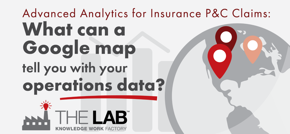
Answer: Tons more than you might think!
You’ve probably heard a lot about business-intelligence, or BI, analytics. It’s also known as “advanced analytics” or simply “dashboards.” If you work in insurance, specifically property-and-casualty (P&C) claims, you need to know all about BI analytics.
Whatever you’ve heard about BI analytics for P&C claims, it pales compared to what you can see with BI analytics for P&C claims.
In this article, we’ll walk you through what you can discover in a single dashboard view—the Map View—for P&C claims. It’s the first step toward the “Holy Grail of P&C”: that is, containing costly claims leakage.
This article is also an accompaniment to a three-minute demo video of BI analytics for P&C claims, which you can view below.
What does business intelligence analytics for insurance P&C claims look like?
Here’s the great thing about BI analytics, for business in general, and for P&C claims in particular: It’s completely intuitive. That is, you don’t need any training whatsoever to use it. This is why executives are, frankly, blown away the first time they see it in action.
A BI analytics dashboard looks like your own private website. When it’s configured by The Lab, it’s a clean, clear display of easy-to-understand info, such as bar graphs or maps.
But they’re not static. Everything is interactive. It’s like an election-night map you might see online: You can hover over different areas to get mouse-over summaries, or you can click specific areas to drill down. Guess what? Those election-night maps are using BI analytics, too.
In short, BI analytics is able to pull massive quantities of data, in real time, from a nearly unlimited number of sources, and then crunch all that data and present it visually.
Think of it this way: Have you ever tried to make a business decision based on a 20-tab Excel sheet? You can’t.
Not long ago, the power of BI analytics was only available to the country’s biggest players in P&C. Not anymore. The Lab has democratized BI analytics. We’ve leveled the playing field.
Click your way to power
The BI analytics Map View we show in the video is from a mashup of real P&C carriers, with all of the information anonymized.
At its widest view, it presents a map of the United States. The top and left feature clickable filters; the right side presents a high-level summary—in days, numbers, and dollars—of whatever you’ve filtered for.
At the top, for example, you can filter for different claims teams, including CAT (catastrophic) status, and even the name of the CAT event (e.g., hurricane or wildfire). You can filter for FNOL (first notice of loss) start- and end-dates. You can filter out claims with “$0 loss paid,” that is, claims that didn’t meet the deductible.
As you click your way through those filters, the map below will automatically update, visually. You’ll see dots over the map; these represent claims. And it’s totally intuitive: The bigger the dot, the more claims. Green dots mean lower payouts; red dots mean higher payouts. Simple as that. And you can zoom in, or out, as much as you like.
Filters and sub-filters
On the left side of this particular BI analytics dashboard for P&C claims, you’ll see a list of clickable filters for “Loss Group,” with categories such as “Earthquake,” “Fire,” “Wind,” “Water,” and so on.
Beneath those categories are clickable sub-categories for “Cause of Loss,” which update when you click a Loss Group. As you’ll see in the video, we clicked “Water,” which revealed causes including “Appliance leak,” “Mold,” “Sewer backup,” and others.
Here’s where it gets powerful. Let’s say you want to drill down to “Water Pipes.” Just click it. Let’s say you want to zoom in to Florida. Just click it! You’ll see all the claims appear on the map, based on your own actuarial data!
You can keep clicking, and keep zooming. In the video, we drill down to Lee County, Florida, where “Water Pipe” claims are broken out by individual zip code!
And whatever you click, gets updated in the summary numbers on the right. So you’ll have a continuously running tally of number of closed claims, average loss paid, average amounts paid for A&O (Administrative & Overhead) and DCC (Defense and Containment Cost), and even the average number of days from FNOL to first pay and last close—all for the date-range you’d selected.
Check out the video and prepare to be amazed. Then contact The Lab. We’d be happy to book your free, no-obligation 30-minute screen-sharing demo, in which you can see how we can put BI analytics to work for your P&C claims operation—and how we do it all remotely, from our U.S. offices in Houston! Call The Lab at (201) 526-1200 or info@thelabconsulting.com today.